
Tuesday, August 4, 2009
Parallel Coordinate Graph
Accumulative Line Graph

An accumulative line graph allows two probable sets of data to be graphed on the same axes.

Correlation Matrix

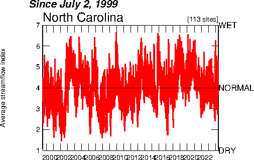
Index Value Plot

An index value plot allows to show information that is current alongside data that was collected previously. This image is showing streamflow compared to the previous year in North Carolina.
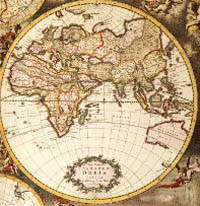
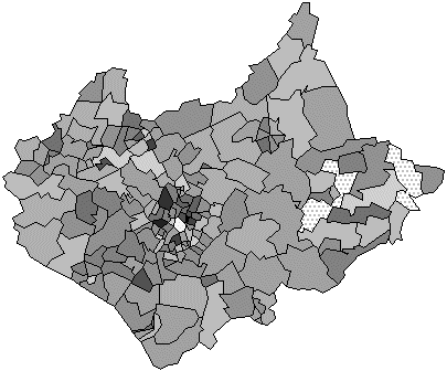
Cartographic Map

Mapping has been around for many many years, and cartographic maps can be images depicting various numbers of things. Cartographic maps are not necessarily maps of physical features, but can also show cultural boundaries. The map seen above was a cartographic map of what inhabitants thought the world looked like and therefore documented it as such.
Planimetric

A planimetric map is a surface map in which no relief is shown. These are often associated with street maps such as the one shown above. It is only necessary to show two dimensional information for the purpose that it is being used for.
Star Plot

A star plot is yet another way of plotting data. It is multivariate data, showing a lot of different aspects, but each individual star is only a display of a single observation.
Thursday, July 30, 2009
Stem and Leaf Plots

A stem and leaf plot is a statistical method of mapping in which data can be directly shown numerically and still be organized. These maps allow views to see how the variable may be distributed throughout the population.
Wednesday, July 29, 2009
Population Profile

A population profile breaks up a particular population and breaks it up into smaller parts so one can better evaluate elements that are making up the population. This graph is depicting different age brackets between male and female bees.
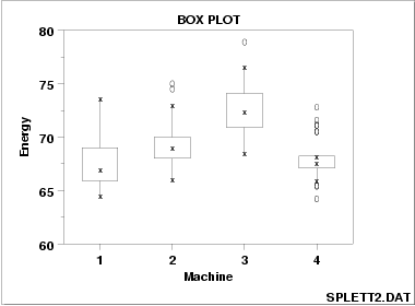
Box Plot

A box plot is another way of graphing data. Each plot on these graphs however signify a great deal more in mathematical terms. There are five different numbers pertaining to each individual plot.
Histogram

A histogram is a mathematical display used to show the frequency of whatever is being measured.
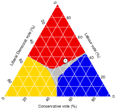
Triangular Plot

A triangular plot such as the one seen above, plots three seperate variables in order to find a common plot between them. This map is showing three different types of votes, and the gray area is where all three merge.
Windrose

A windrose is used in meteorology in order to show the wind speed and wind direction for a particular area. This windrose was developed based on data in Washington.
Climograph

A climograph plots the level of percipitation as well as the the temperature. Data is plotted for one place at a time. This particular image contains data from Mephis, Tennessee
Tuesday, July 28, 2009
Scatterplot

A scatterplot is a way to plot data sets for two seperate variables. The scatterplot above plots the wife's ages vs. their husband's ages.
Univariate Choropleth Map

Bivariate Choropleth Maps

Bivariate choropleth maps show two seperate images of the same area displaying two different variables. The map above shows the difference in soil moisture between the same day on two seperate years.
Bilateral Graph

A bilateral graph plots two variables and also takes into account a third varible which effects the initial two. This particular map show's the dispatch of experts vs. the dispatch of JOCVs and additional informs the number of trainees accepted.
Classed Choropleth Maps

Classed choropleth maps are a type of choropleth maps but typically displays data for states, and counties. The data is combined into a smaller number of groups and then portrayed in intervals.
Saturday, July 25, 2009
Unclassed Choropleth Map

Range Graded Proportional Circle Map

Continuously Variable Proportional Circle Map

A Continuously Variable Proportional Circle Map is a type of point pattern map. Proportional circle maps plot data with circles as opposed to dots and the size of the circles are representative of the data being plotted. The map shows the urban population in Michigan using various proportional circles.
DOQQ

A DOQQ map is an aerial image combined with geometric qualities found on a map. Specifically, the map has been georeferenced and orthorectified which removes the distortion often found in aerial photos so that they can be used as flat maps. The image above is a DOQQ map of Washington, D.C
DEM

DLG

DLG's can represent various types and amounts of data. DLG is a digital line graph representing digital vector data. Depending on what type of data is being shown, it may be depicted through various lines, points, or shapes. The DLG map seen above is an image of Boston.
DRG

This is a DRG image, which stands for digital raster graphic. DRG's are scanned images of USGS standard series topo maps. This particular image is of Emerald Bay State Park.
Monday, July 20, 2009
Isopleths

An isopleth is a contour line of equal value, much like the images seen below. These can be used to represent anything to signify constant value. Here the map is showing the various levels of chlorides in the river.
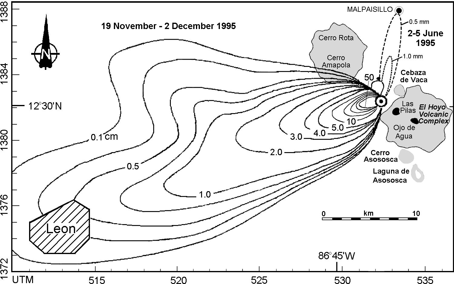
Isopach

Wednesday, July 15, 2009
Isohyets

Isohyets are again one of the many types of contour lines used in meteorology. These lines specifically are used to depict levels of rainfall.
Isotach

An Isotach is very similar to an isobar in that it is also a contour line that signifies certain information. While an isobar is a constant measure of pressure, an isotach is a line showing constant wind speed. Both are commonly seen in meteorology.
Isobars

An isobar is a contour line that is used to depict a constant pressure in meteorology. This image is showing the barometric pressure in Europe as well as over the Mediterranean sea. Once you identify a pressure with a certain spot on a line, you can then follow that line and along the entire line it will be the same pressure.
Hypsometric Map

This hypsometric map is proportionally showing the differences in elevation across the Earth's entire surface. There is a scale, with lines drawn to give specific numbers so one may properly see the differences.
PLSS

Public Land Survey System is a non-coordinate locational system. It is a form of georeferencing in the sense that it assigns locations, but it does not do so in the form of coordinates. Another form of a non-coordinate system would be a postal address, or zip code.
Cadastral Map

Cadastral maps show specific boundaries and ownership of certain land parcels. This image is a very large scale map, but other cadastral maps may zoom further in providing further detail.
Monday, July 6, 2009
Topographic Map

This topographic map is of Waterford, VA. Topographic maps show natural as well as man made features. The multiple lines show differences in elevation. Topographic maps are typically of large scale. Shading techniques can also assist in showing differences in elevation.
Friday, July 3, 2009
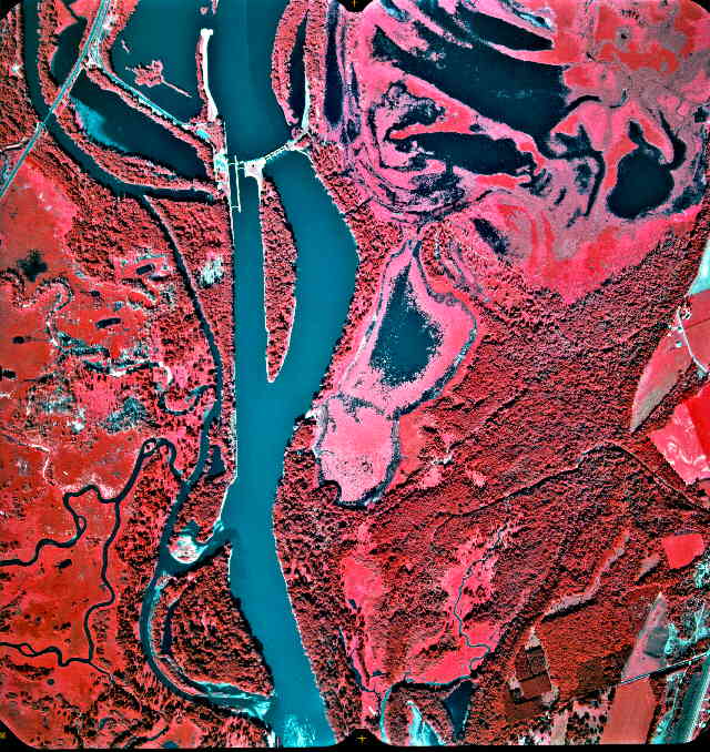
Infrared Aerial Photo

This infrared photo is a shot of the upper Mississippi River. Infrared emulsion is more sensitive to wavelengths that the human eye cannot see. The wavelengths are not truly red, but modified so that we may see them. In certain situations, it may be easier to distinguish details using infrared as opposed to the same black and white photo.
LIDAR

LIDAR, which stands for Light Detection and Ranging, is one of many remote sensing tools. LIDAR specifically uses laser, which is light amplification by stimulated emission of radiation, instead of radio or microwave radiation. The above photo is of a crater. LIDAR is a common tool used by the military in determining distances between areas.
Doppler Radar

Doppler radar allows images to be developed using multiple sets of specific data such as distance, temperatures, precipitation, etc. Constant collection of this data allows society to be aware of upcoming weather, allowing us to be prepared.
Statistical Map

This map shows the statistical map showing the traffic related accidents on Ohio interstates. Statistics can be shown in mapping through various techniques. This particular map makes it easy by placing neon colors of different thickness over top of a black and white aerial photo.
Black and White Aerial Photo

Aerial photos are crucial when using techniques such as photogrammetry when multiple aerial photos can be put together in a system to provide a 3D view of an area. This aerial shot was attempting to get a different view of the bridges seen crossing the waterway.
Wednesday, June 10, 2009
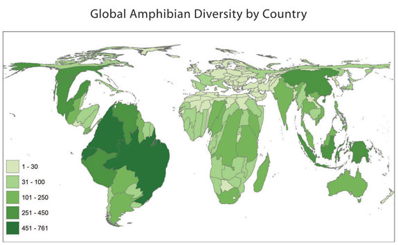
Cartogram

A Cartogram takes an existing map and distorts it in a way that will more effectively reflect the information at hand. The map above is specifically known as an Area Cartogram as it shows population of amphibian diversity across all countries of the world.
Propaganda Map

The image above is a form of a Propaganda Map because it takes information that is not necessarily fact and portrays it in a way as if it is truth to sway the minds of others. Propaganda Maps have been used for many years by all countries in war, political battles, and social conflicts. This particular map is a picture of a man who is in clear opposition of the republican party in America and therefore portrays information in a way that may make others favor his similar views.
Monday, June 8, 2009
Proportional Circle Map

This Proportional Circle Map is indicating the Mexican population within the western United States in 1990. The various sizes of the circles indicate the population size within particular areas. Also as a Thematic Map the proportional circles reflect we see the theme of Mexican population across the entire area.
Choropleth Map

The map above is an example of a Chloropleth map which summarizes the distribution of a particular topic, in this case millions of dollars spent by overseas residents across Great Britain. The distribution data is based on specific boundary lines as indicated in the image. Chloropleth maps are another sub-category within Thematic Maps.
Friday, June 5, 2009
Flow Map

Again, a subcategory of Thematic Maps, Flow Maps in particular show the movement between places. The map above is showing the movement of trucks across the U.S put out by the department of transportation. The different thickness in the lines indicates the quanity of flow of trucks. With an increase in thickness, the key indicated that this means an increase in the number of trucks moving from point A to point B. While that was the main focus of posting this example, the map above also a choropleth map with different shades of color indicating volume of flow state to state.
Monday, June 1, 2009
Isoline Map

An Isoline Map is also a type of Thematic Map but in this case uses lines as a means to represent the data at hand. A line is drawn connecting different points of equal value. The above map shows data of pressures across the U.S, and here we see lines drawn in for all points containing equal pressure. Because of how the pressures form, this data allows the lines to create circles, but this is not necessarily always the case.
Dot Distribution Map

A Dot Distribution Map is also a form of a Thematic Map, specifically using dots however to portray the data. This particular image is mapping the population distribution across Ohio. Areas of thick dots which seem to blur into a large green splotch, are areas of high density. Again, this is simply a plain base map of all townships within the state with population data superimposed over top of it.
Mental Map

The map above represents an example of a mental map. A mental map is the way a particular person or group of people, in this case referring to the entire United States of America, views information or a particular situation. The image humorously pokes fun at how Americans view the rest of the world focusing on the idea that America is the best place to be. While every individual has their own personal mental map of whatever is being discussed, this image groups a very large population together and states that this is what all Americans think. Of course one must always consider than each individual still has their own view.
Friday, May 29, 2009
Thematic Map

This particular map is a Thematic Map because as the name suggests, it represents a theme about a certain area. A Thematic Map shows information about a particular subject superimposed over a base map. In this case, the image is reflecting the population change across America over a six year span. Many different sets of data can be represented in the form of a thematic map, and there are several types of thematic maps. Often maps can be labeled thematic in what they're representing as well as another kind of map in how the information is being reflected.
Subscribe to:
Comments (Atom)