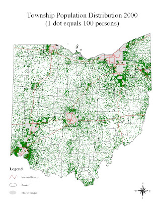
A Dot Distribution Map is also a form of a Thematic Map, specifically using dots however to portray the data. This particular image is mapping the population distribution across Ohio. Areas of thick dots which seem to blur into a large green splotch, are areas of high density. Again, this is simply a plain base map of all townships within the state with population data superimposed over top of it.
No comments:
Post a Comment